Redesigning Police Mortgages — A Clearer Path To Conversion
5x increase in mobile traffic after launch
The Challenge
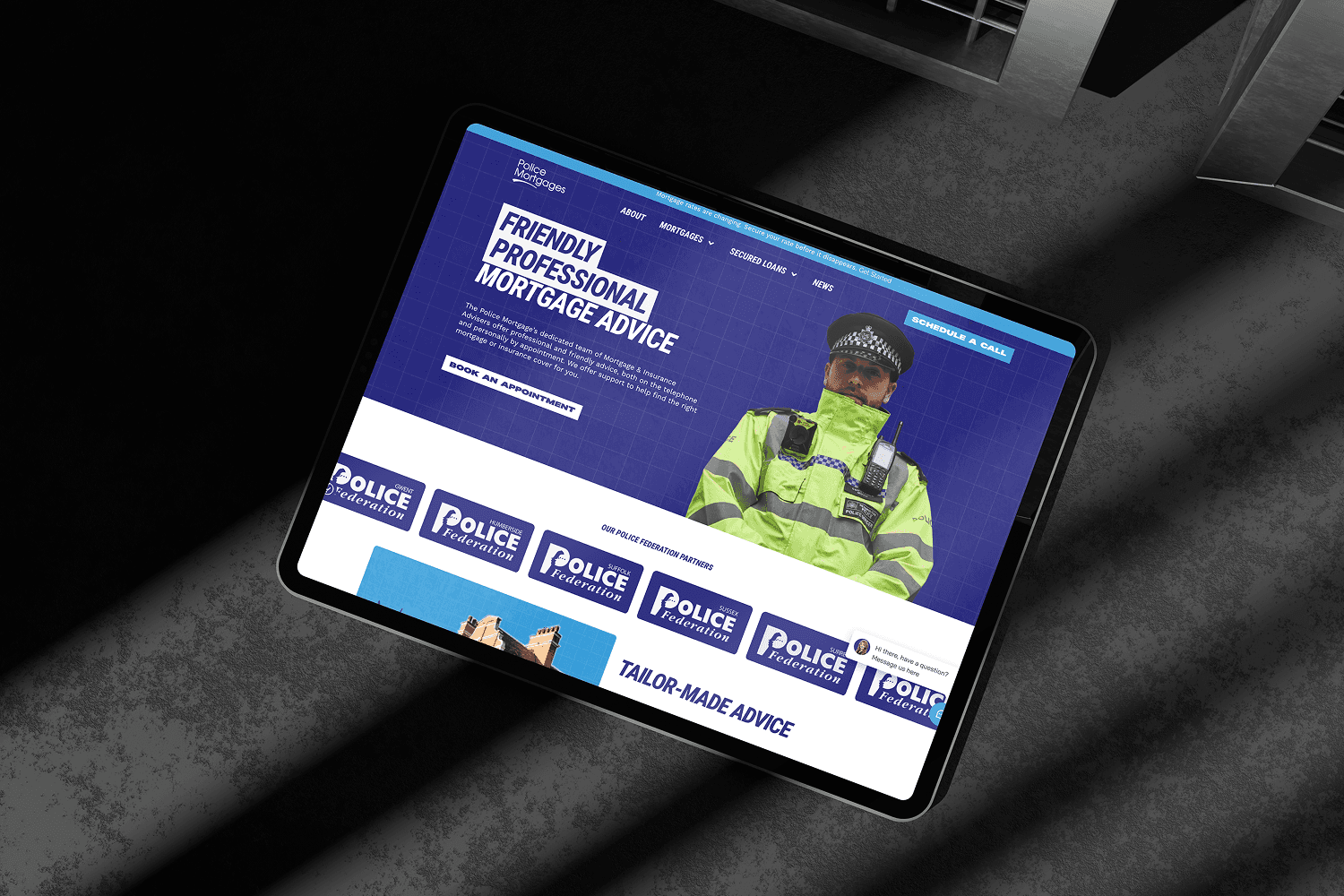
When I first looked at the Police Mortgages site, it was immediately clear: users couldn’t find what they were there for.
There were no clear CTAs, mobile navigation was clunky, and the structure made it hard for users to know where to start or how to make an enquiry. This was especially critical because their audience—UK police officers—often access information on the go.
What I Did
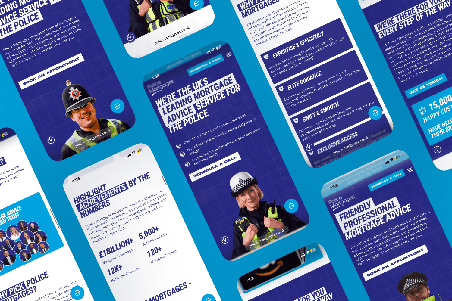
I redesigned the site from the ground up to prioritise:
Mobile-first navigation
Clear, persistent CTAs (like “Get a Mortgage Quote”)
Straightforward content layout, with key information surfaced early
I also used analytics and heatmap data to identify drop-off points and pain areas. This helped shape how information was grouped and where attention-grabbing sections were placed.
The new design featured:
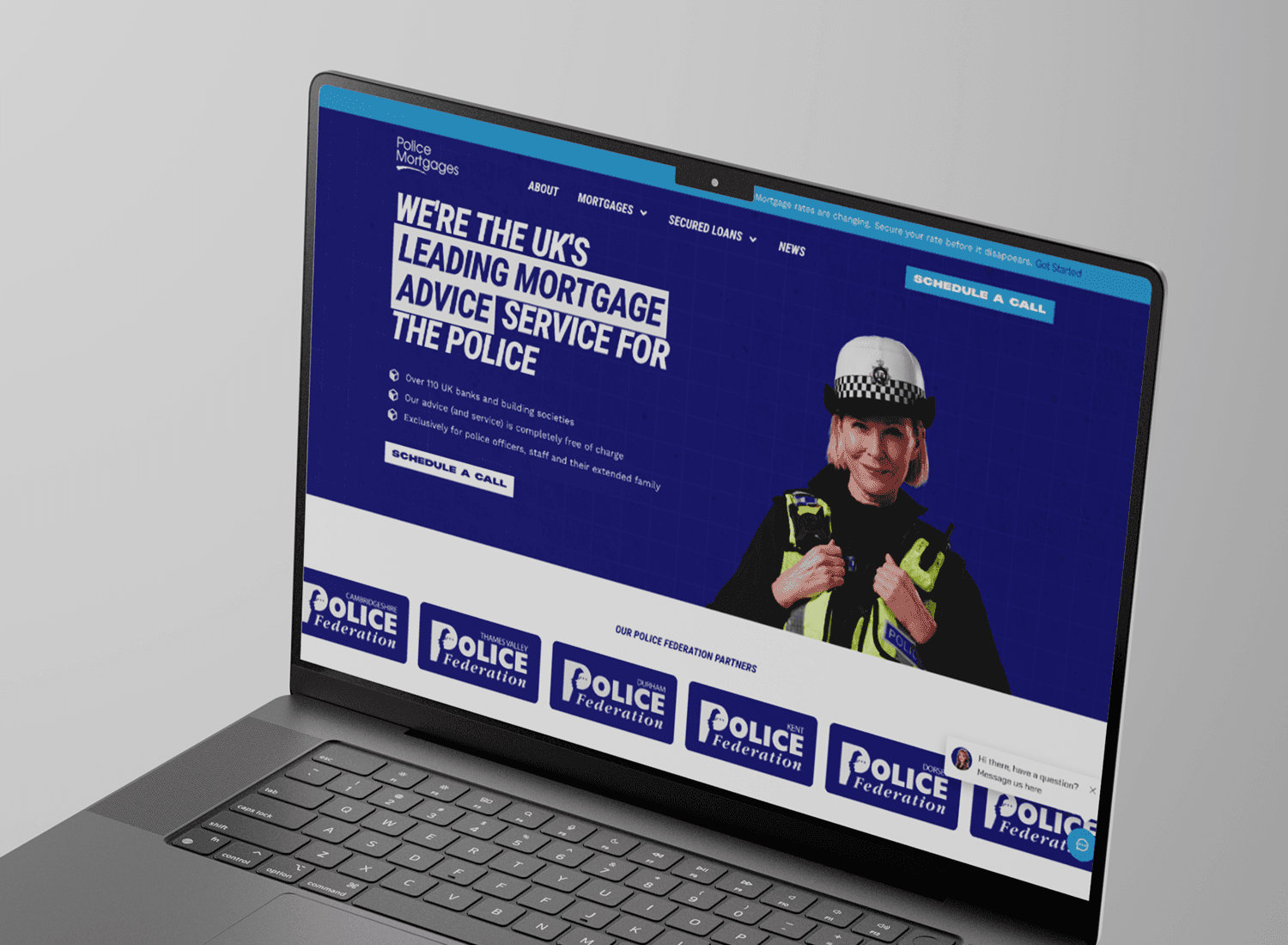
A simplified homepage flow with direct callouts to mortgage types
Refreshed typography and visual hierarchy for easy scanning
A sticky button for quick quote access, especially on mobile
The Result
Within a few weeks of launch, the site saw:
5x increase in mobile traffic
Longer session durations
More enquiries submitted directly via the homepage
The new design didn’t just look better—it made the site useful. It gave users what they needed with fewer clicks and clearer messaging.
Takeaway
This redesign is a good reminder that small structural decisions—like adding a sticky CTA or reordering sections—can have a measurable business impact. It’s not always about big design changes. It’s about clarity.
More Articles
Notes from behind the screen
Ready When You Are
No fluff, no confusion — just thoughtful, well-built digital experiences.