The Challenge
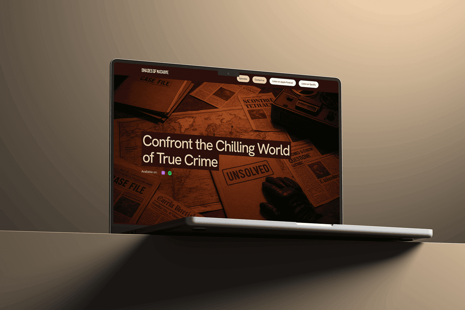
The goal was to build a brand identity that felt investigative, serious, and story-led—without relying on cliché horror aesthetics. The podcast needed a strong, flexible visual system that could work across platforms while capturing the unsettling tone of the content.
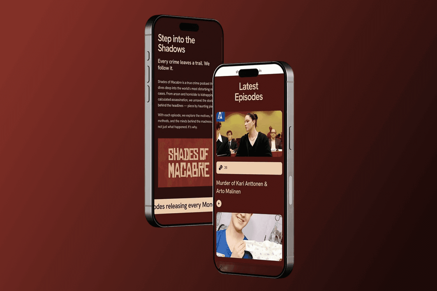
Another challenge was accessibility—listeners needed a way to stream episodes directly from the website without requiring Spotify or Apple Podcast accounts, making discoverability and ease of access a key part of the design solution
The Solution
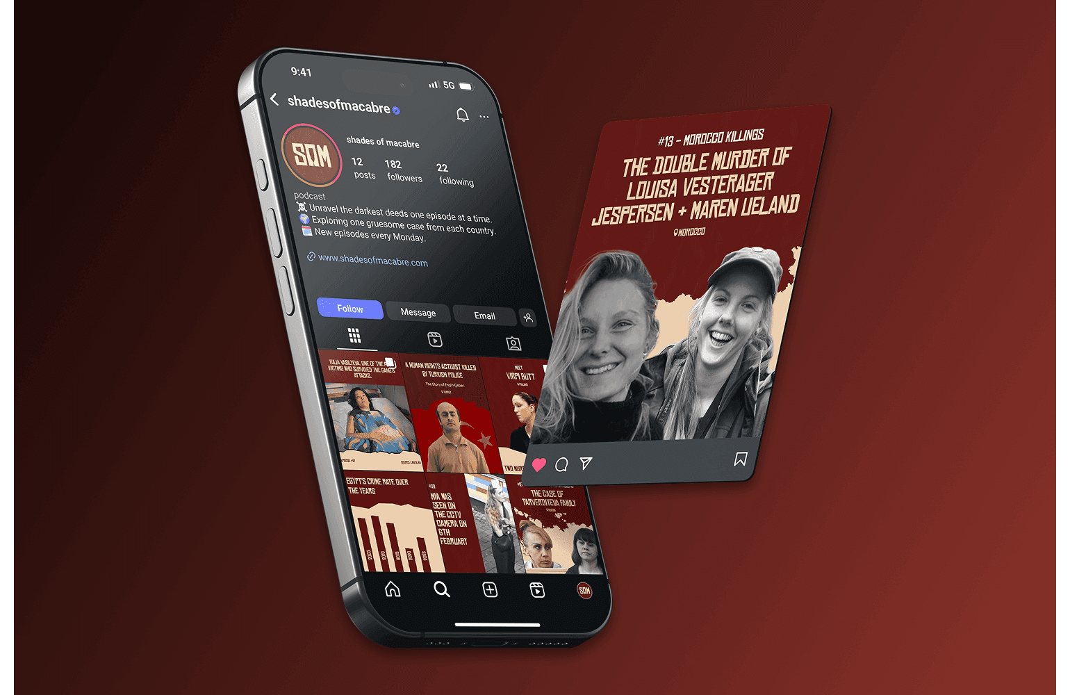
A complete visual identity was developed from scratch, including logo design, social media visuals, and brand language.
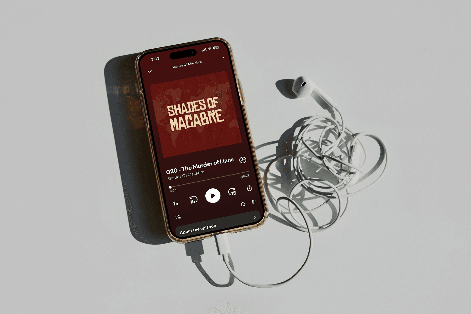
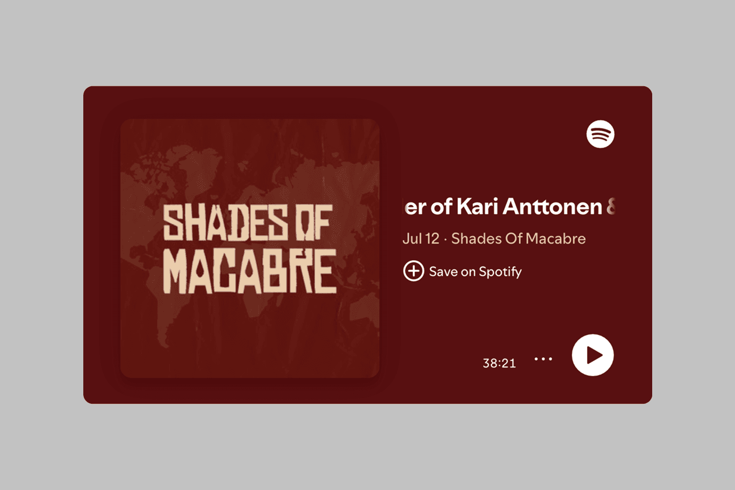
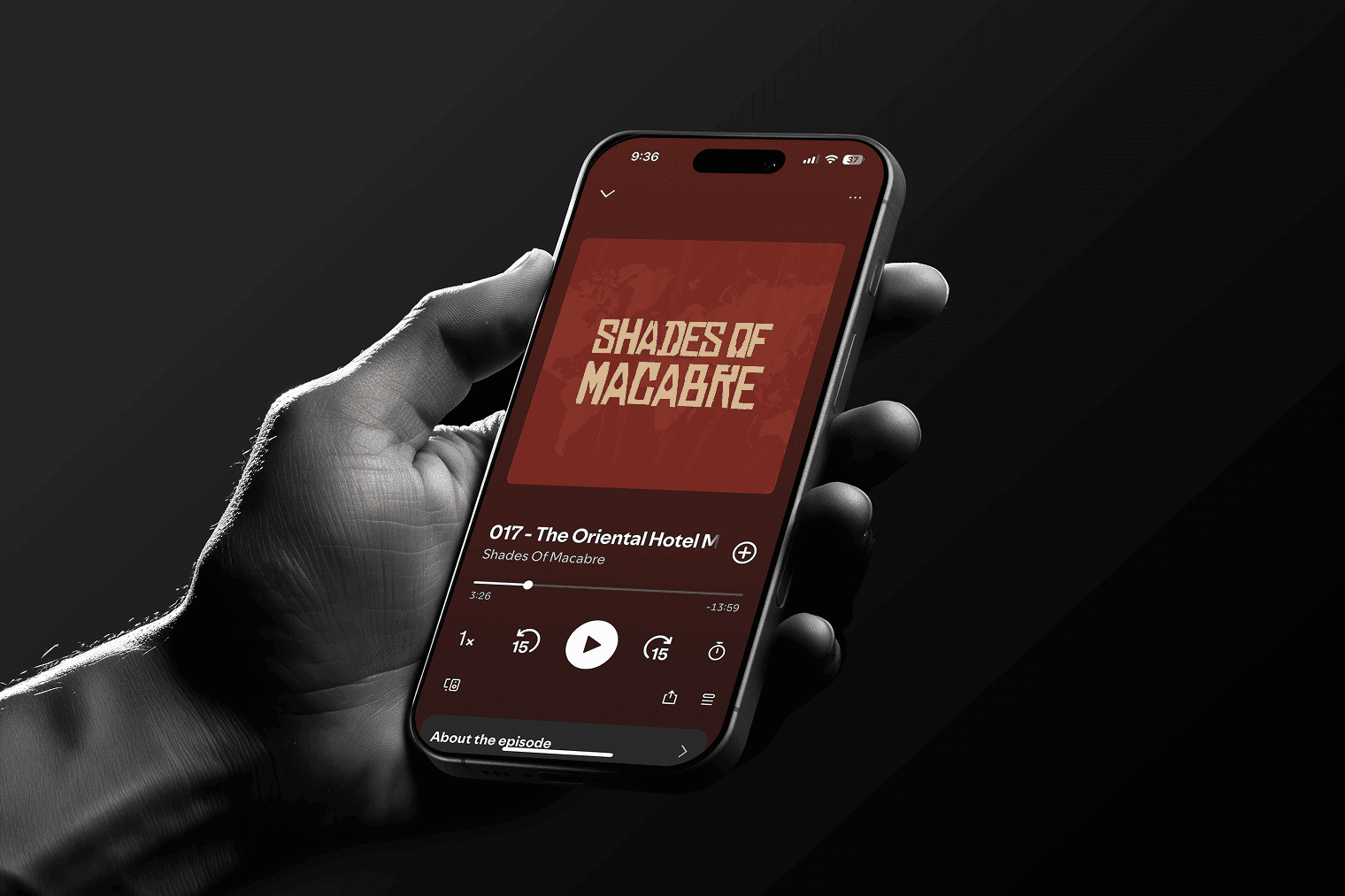
The primary logo features distressed typography and sharp, uneasy forms to reflect chaos and dissonance. Knife motifs and tape-inspired textures were subtly integrated to evoke themes of investigation and crime. A secondary “SOM” mark was designed for use across thumbnails, merch, and social templates.
The colour palette draws from deep burgundy and muted bone tones, inspired by aged case files and forensic archives—paired with rough textures for a raw, archival feel.
Outcome
The visual identity gave Shades of Macabre a bold, recognisable presence across podcast platforms, merch, and social media. With a clear and scalable system in place, the brand continues to grow—supported by ongoing creative work across promos, seasonal updates, and new formats.